Loading, please wait.
May - Feathers & Finery
Over the past few months we have been involved in quite a bit of retail design... its amazing to see how many new shopping centres are being built as well as old centres that are revamping and growing. This can only mean that business is booming and that tenants, old and new, have to keep up with the face-lifts and trends to be noticed within these new spaces.
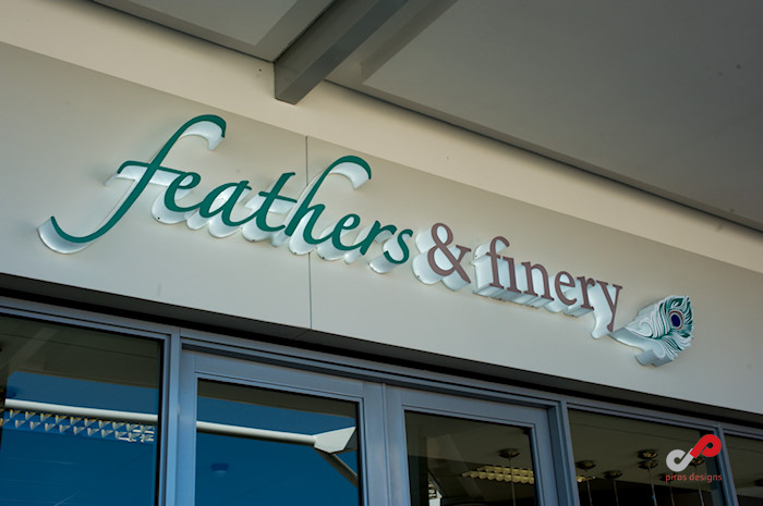
We recently worked on a new store in the Waterfall Corner Shopping Centre, called Feathers & Finery.
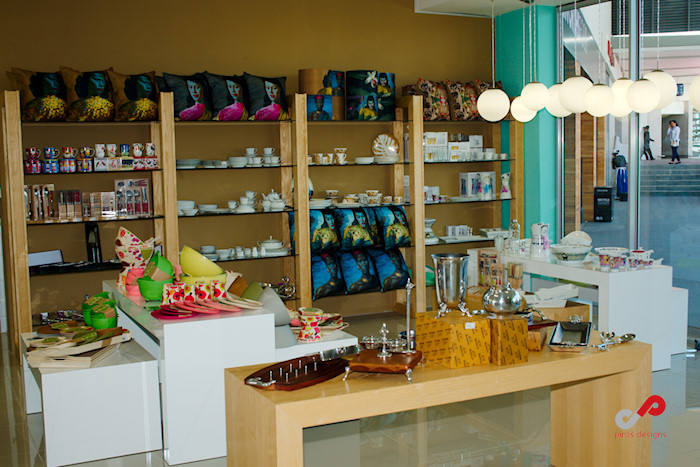
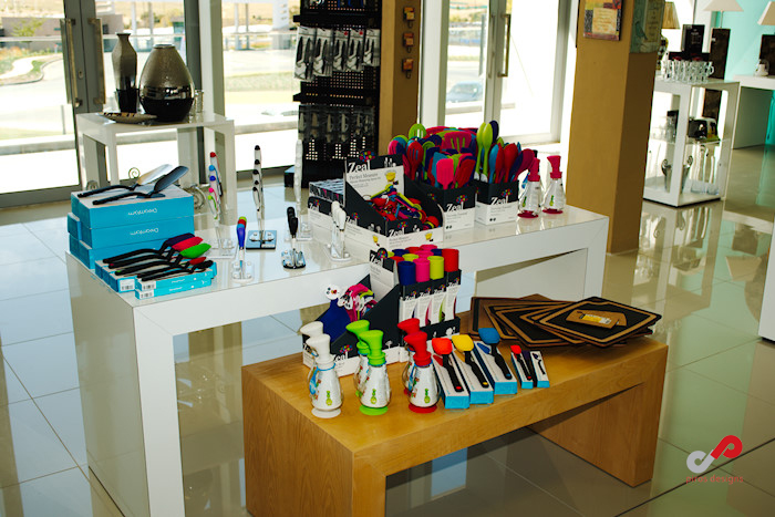
This is the first Feathers & Finery store and is well positioned between Woolworths & the Remo’s restaurant. They stock stunning home décor and kitchen products, offering high quality, unique products to their clientèle. Owners, Dan & Sandy, have been involved with home retail stores for numerous years and have great experience in sourcing gorgeous products for current trends and customer demand!
The brief for the store was to create a functional space that would stock a mix of modern and vintage products. Client requested that the space be current and appealing to the broad market.
So, with the brief in mind we looked at what similar, competitor stores were doing, what current trends are for décor stores as well as essential functionality required within such a space. After doing research and defining the look and feel we were after, we created the CI for the store. CI is critical and must tie in with what is reflected in the interior to create a holistic look and feel! The logo designed is delicate, light and lends itself to the items stocked. The peacock feather brings in a cheeky element boasting bright, bolder colours - proud as a peacock - standing out from the crowd!
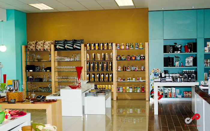
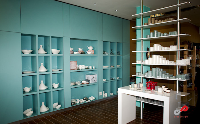
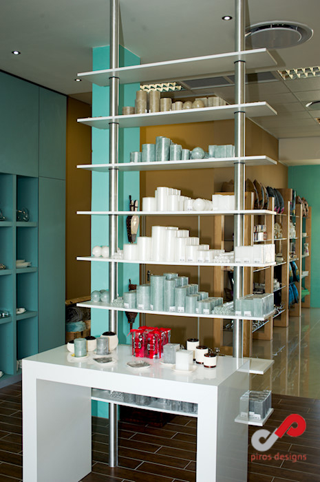
Feathers & Finery is blessed with ALOT of natural light... there are beautiful double volume windows which open up onto an outside patio at the back of the store and a full length, glass shop front - a rare commodity in retail spaces; an abundance of natural light! The space created is light and open for easy movement and to allow for variation of the displays based on the stock currently being brought in. We wanted to create a warm, versatile and appealing environment for customers to enjoy and that allow the beautiful stock items to be highlighted. The use of the light ash wood veneer creates connectivity and warmth. The wood grain has been repeated on the floor with timber-look tiles down the centre of the store - again connecting the various areas.
The service counter has been centrally positioned to allow for maximum usage of display space along the walls. on either side, and to create a central hub where customers will migrate to once they have feasted their eyes and decided what items to purchase! The peppermint colour is refreshing and creates a break from the neutrals and whites that have been used in the rest of the interior. We also brought in the “fun”, “bright” element of the peacock feather with use of the vibrant round lights of varying sizes. This creates movement and breaks with the structured balance within to create wonderful glow, highlighting the shop front, especially when lit up at night - eye candy for every passer-by!
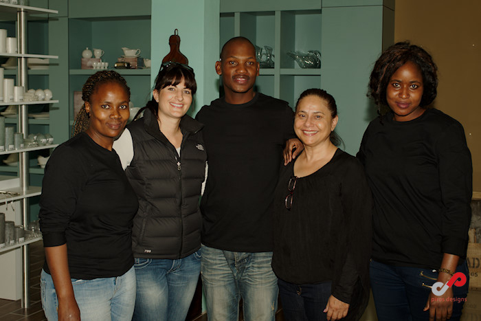
This was a wonderful project to work on and would like to thank all involved that brought the concept to life!
Wishing Sandy & Dan all the very best and looking forward to many more projects together!
Comments are closed for this post, but if you have spotted an error or have additional info that you think should be in this post, feel free to contact us.